

Gestilar
Gestilar is a promoter of the real estate sector, it has projects where they pay attention to even the last details. The excellence, exclusivity and luxury of the final product are the most important attributes of the brand.
Before
After


In the redesign of the brand, an important aspect was to keep the upward pointing "arrow", but in a more elegant, modern and timeless form. The new image had to visually reflect the values and attributes of the brand.

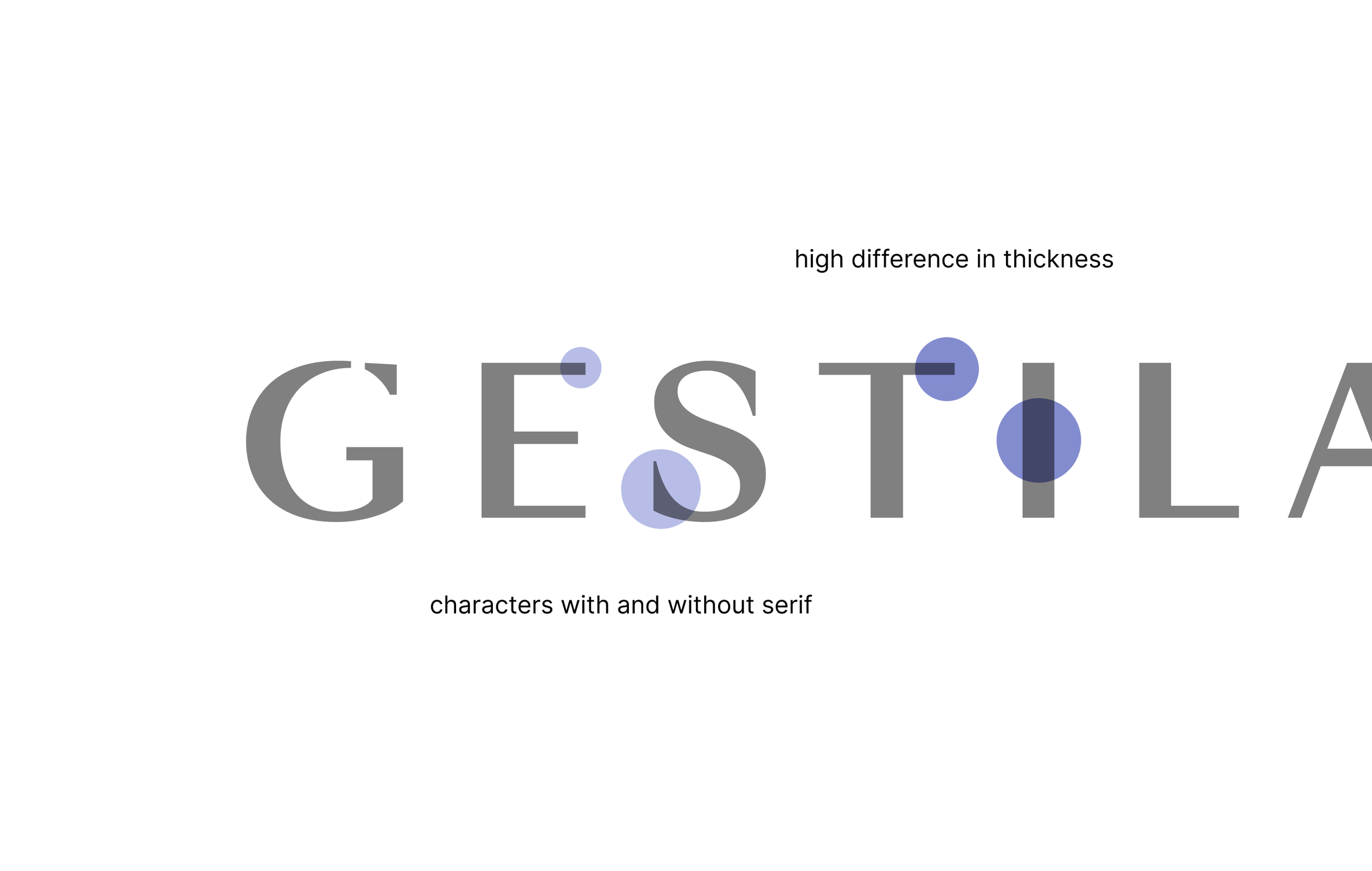
The concept is based on contrasts, which are the basic tools of all visual trends, including architecture. Swiss Typeface Sangbleu's elegant and form breaker (glyphs with and without serif) font family forms the backbone of the design concept. In the case of layouts and visual elements —like frames, decorative orientative elements and margins,— we used the proportions of the widths determined by the font, thus creating a coherent and clean visual world.

We enhanced the basic colors, and in addition to the primary colors, we defined a secondary and tertiary color scale as well, thus creating an opportunity to differentiate the numerous segments and projects and to further advance the project.


Stationery elements
Entire redesign for the brand and its apperiance, from offline elements to digital ones. Focusing on contrast and elegance as the cornerstone of their architectural style.


Brochures


Online and social media apperiance

Office interior visual design

Billboards for projects
WeAreMarketing