

Gestilar
Gestilar is a real estate developer known for its meticulous attention to detail. The brand’s core values are excellence, exclusivity, and luxury, which define every aspect of its projects.
Before
After


In the brand redesign, it was important to retain the upward-pointing “arrow”, while giving it a more elegant, modern, and timeless form. The new visual identity was designed to reflect the brand’s core values and key attributes.

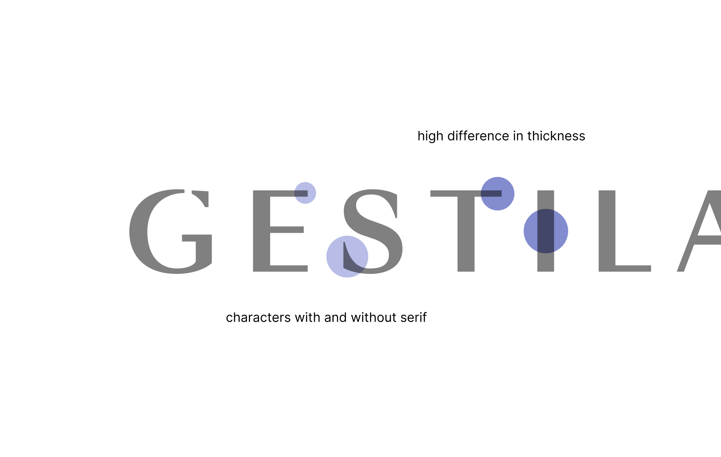
The concept is built on contrasts, a fundamental principle across all visual trends, including architecture. The Swiss typeface Sangbleu, with its elegant and form-breaking glyphs (both with and without serifs), forms the backbone of the design. For layouts and visual elements—such as frames, decorative directional elements, and margins—we based the proportions on the widths defined by the font, resulting in a cohesive and clean visual system.

We refined the core color palette and, in addition to the primary colors, defined secondary and tertiary color scales. This approach allowed us to differentiate between various segments and projects while further enhancing the overall brand identity.
Complete brand and visual identity redesign, covering both offline and digital touchpoints. The redesign emphasizes contrast and elegance, reflecting the brand’s distinctive architectural style.


