Turia magazine
Background
Turia is a long-established weekly magazine with a strong cultural presence in Valencia. The publication covers current cultural programs, television listings, cinema news, and editorial content related to sports and gastronomy.
Project Overview
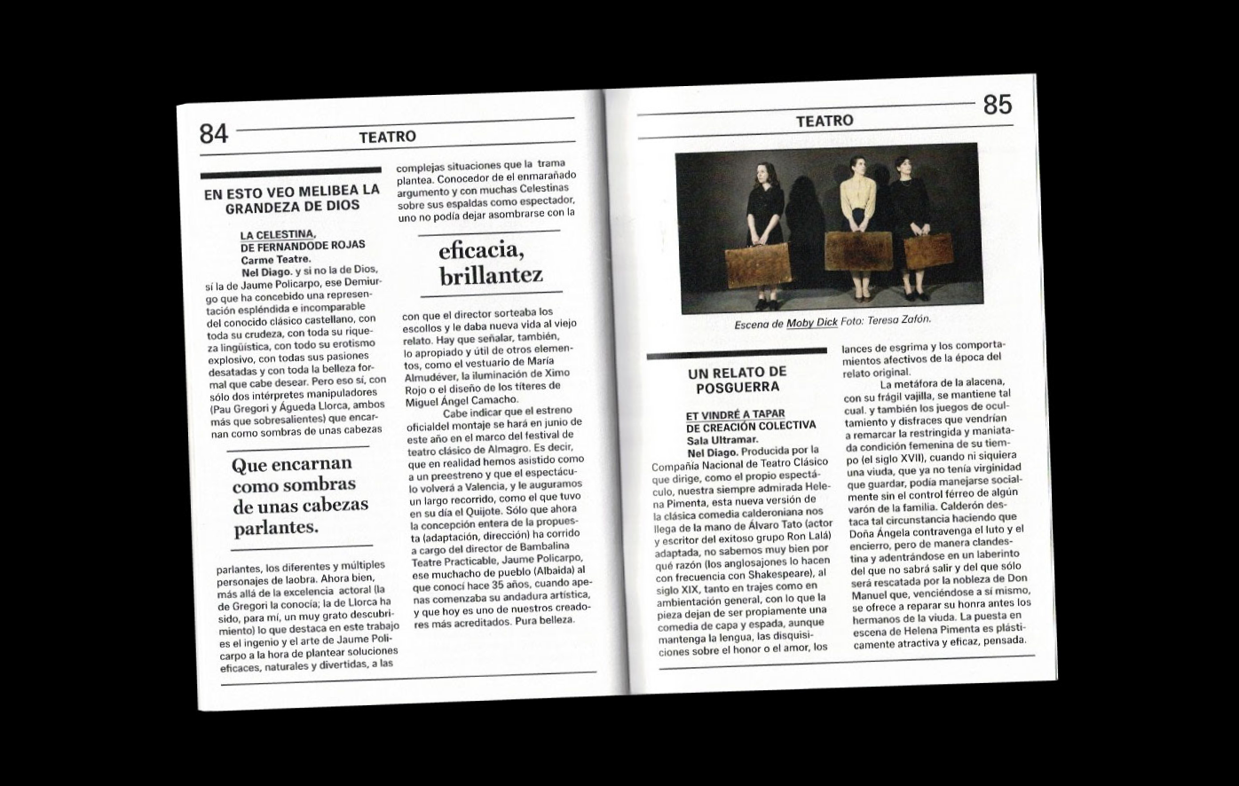
The project focused on redesigning the structure of the magazine while preserving its original concept and editorial spirit. Historic editions of Turia served as the primary source of inspiration, ensuring continuity with the publication’s visual heritage. The goal was to create a clearer, more flexible layout system that could support future issues with ease.
Results and Impact
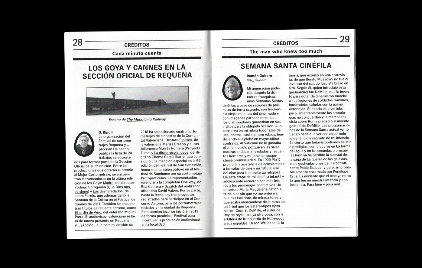
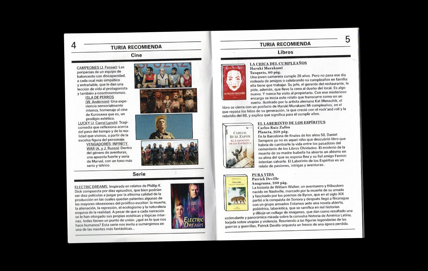
The redesigned publication is organized into clearly defined sections, allowing for a more user-friendly reading experience. To optimize production costs, a single-color approach was applied, and the magazine was divided into two distinct parts based on content. The central section appears in black and white, while color imagery is reserved for sections such as gastronomy and cinema, where visual richness is essential.
The iconic “Egg of Columbus,” a long-standing symbol of the magazine, appears throughout the publication and became the basis for many of the newly designed graphic elements. This approach resulted in a refreshed yet familiar visual identity that respects Turia’s history while supporting its ongoing evolution.
Size
12,5 cm x17,5 cm
Extent
89 pages
Fonts
Hans Grotesque, HK Serif
Design and concept
Diego March Ávila, Dóra Hujber
Print
PQR Reprografía
EASD Valencia, 2019


